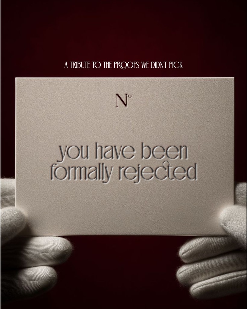
Every strong identity starts with exploration. I present options on purpose—different moods, type treatments, color stories, and layout instincts—because design is a conversation, not a single guess. One direction moves forward. The others get formally rejected.
That word rejected sounds harsh until you reframe it. In the studio, it usually means: this visual idea is not the one. Not that the process failed. Not that the craft was careless. Someone looked at a proof, felt the mismatch, and said so. That response is information.
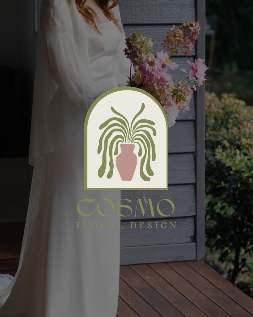
Proofs we didn't pick
These are real alternate directions from client projects—concepts that were explored seriously, built with care, and set aside when a better fit emerged.

Seeing what's wrong is useful feedback
Clients rarely reject a direction because they dislike effort. They reject it because something reads off—too corporate for a warm brand, too playful for a serious firm, too trendy for a business that plans to keep the same mark for twenty years. The moment someone says “not this,” the room gets sharper. You learn what the brand is not, which is often faster than debating what it should be in the abstract.
That is why I do not treat ruled-out proofs as embarrassments to hide. They are part of the map. A moody photographic lockup might teach you the client wants clarity over drama. A hand-drawn mark might reveal they need structure, not charm. Wrong is not empty—it narrows the field.
Rejection pushes you toward the right idea
Good creative process depends on contrast. You cannot know that Direction B is the winner until Direction A is on the table long enough to respond to. Rejection creates that contrast. It turns a pile of possibilities into a decision with reasons behind it.
When I move on from a visual concept, I ask three quick questions before I close the file:
- What specifically felt wrong? Tone, typography, color, imagery, scale—name it if you can.
- What did the client lean toward instead? Even a vague “more like the other one” tells you something about preference.
- What would I try next because of this answer? That is the direction worth pursuing.
Answering those turns a rejected proof into a brief for the next round. The work that follows is usually stronger—not despite the no, but because of it.
Success often shows up after the pivot
The identities I am proudest of rarely came from the first idea on the wall. They came after a direction was set aside, the feedback was absorbed, and everyone recommitted to finding the fit that would actually live on a website, a sign, a business card, and an Instagram grid without feeling forced.
That is the outcome worth aiming for: not winning every concept, but using every response to get closer to the one that holds. A rejected visual direction is not the end of the story. It is often the paragraph where the right one finally becomes visible.
If you are in the middle of a rebrand and one option is clearly not landing, that is not a setback—it is progress. Pay attention to what the wrong direction is teaching you, then go find the idea that feels inevitable. That is where success usually is.