Branding
Everflame Financial Consulting is built on a powerful belief: transformation is possible for every individual, entrepreneur, and organization. Rooted in the symbolism of rebirth, resilience, and forward motion, Everflame exists to guide clients through financial challenges, help them learn from individuals with years of experience, and illuminate a clear path toward their next chapter.
When Everflame approached Noble for branding services, their vision was clear—they needed an identity that captured both their strategic expertise and their deeper purpose: helping others answer their own call to adventure. The goal was to create a brand that felt elevated, intentional, and iconic—one that could stand confidently in the financial consulting landscape while remaining warm, human-centered, and aspirational.
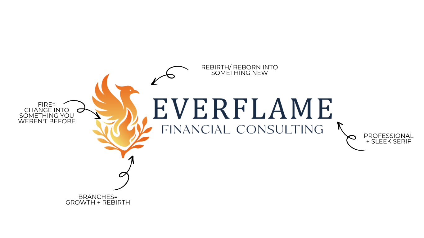
The final brand identity is a seamless blend of strategy, storytelling, and symbolism. Every component—from the flame icon to the messaging—reinforces Everflame’s belief that everyone has the capacity to rise, rebuild, and chart a better future.


