Branding
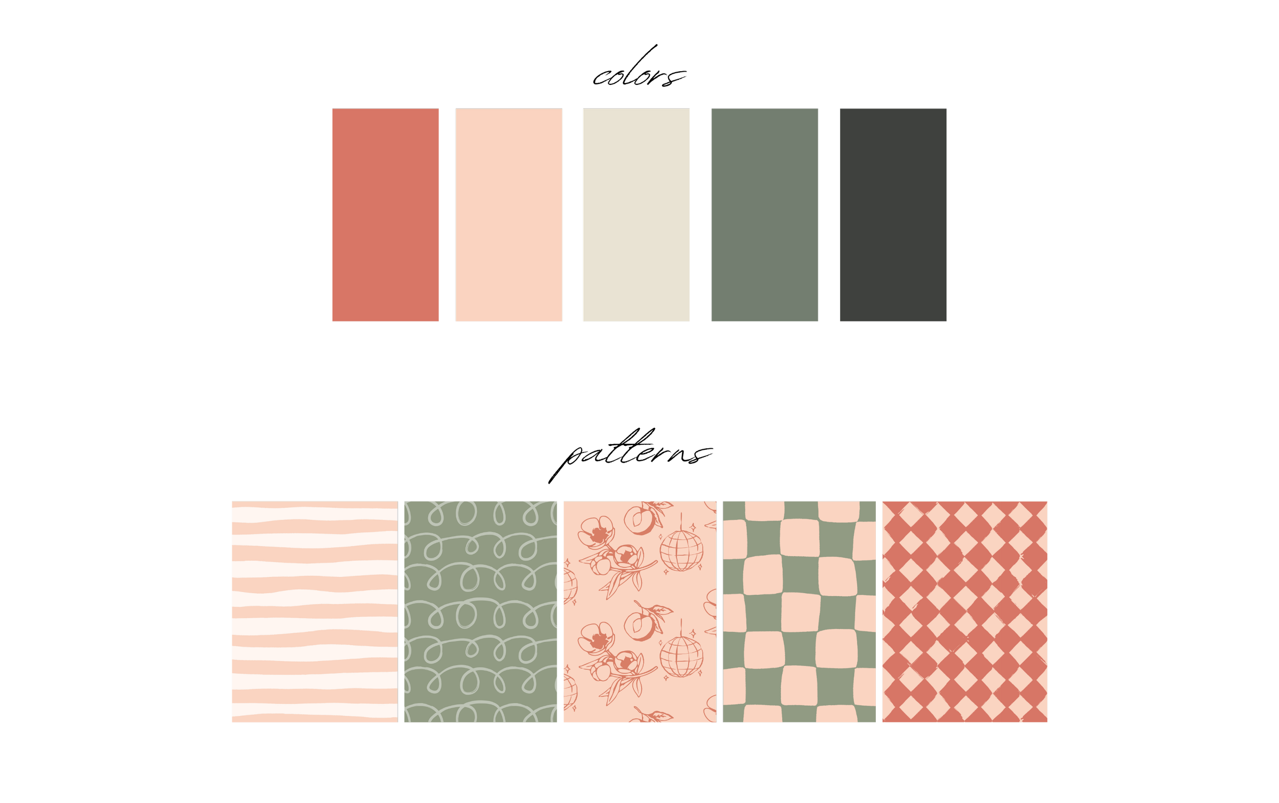
The recent Hey Peaches rebrand was designed to modernize and elevate the boutique while amplifying the fun, confident spirit that defines the brand. The refreshed visual identity embraces clean, contemporary typography and a refined color palette of soft peaches, warm neutrals, and playful pops of coral—creating a look that feels both elevated and approachable. By simplifying design elements and introducing more polished layouts, the rebrand positions Hey Peaches as a boutique that’s chic and trend-forward, while still celebrating its signature playful personality. Lifestyle-driven photography, bold statement graphics, and cohesive packaging further communicate the brand’s core message: confidence should be fun, effortless, and for every woman. This rebrand not only refreshed the boutique’s aesthetic but also strengthened its presence as a go-to destination for women who want to feel stylish, fearless, and unapologetically themselves.
The Hey Peaches rebrand strategically refined the boutique’s visual and verbal identity, creating a modern, elevated presence that aligns with its trend-conscious audience. By balancing sleek design elements with the brand’s signature playful energy, Hey Peaches now communicates a clear and confident message—style should be fun, approachable, and empowering. The refreshed look positions the boutique as a leader in boutique fashion while maintaining its warm, community-driven roots.


